

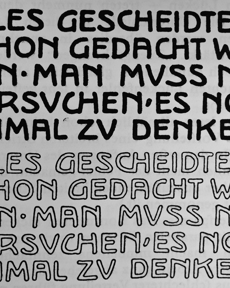
Excerpt from Rudolf Larisch’s »Unterricht in Ornamentaler Schrift« (Zehnte Veränderte Auflage Öst. Staatsdruckerei, Wien 1929)
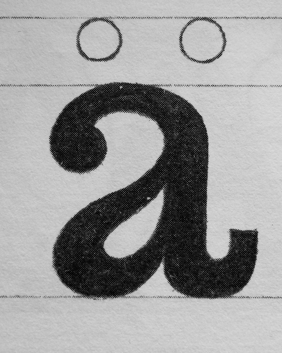
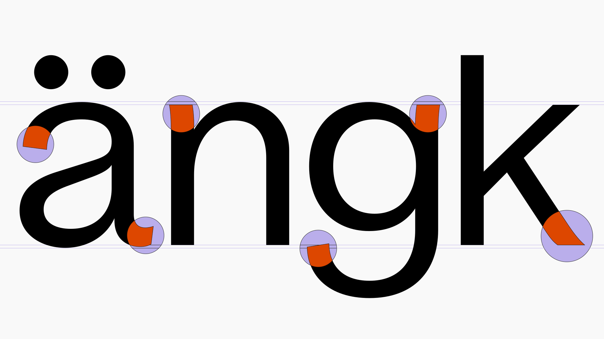
Lowercase a (Egyptienne) from Heinrich Hussmann’s »Über die Schrift« inspired the tension in Viadukt’s a-belly
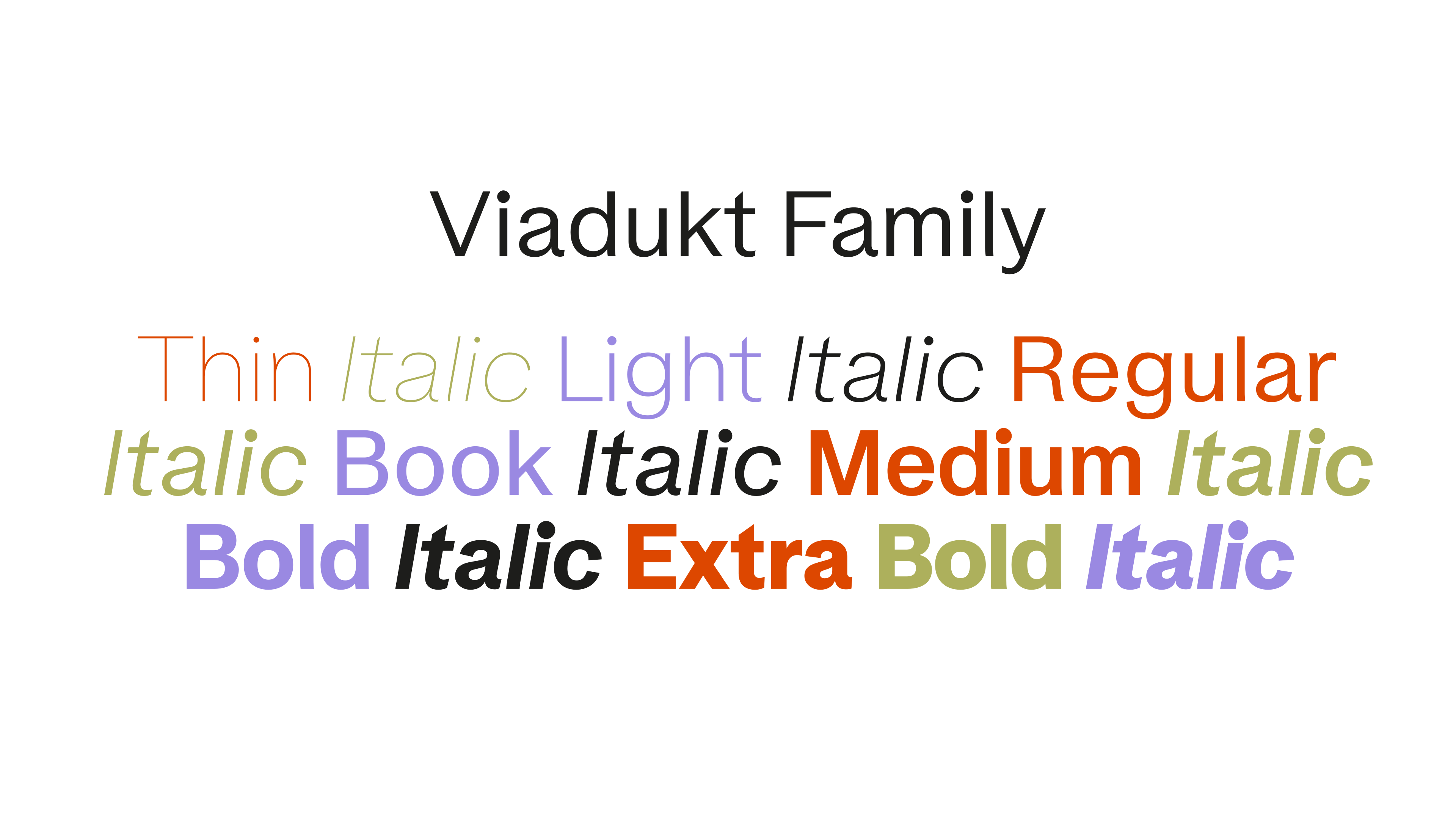
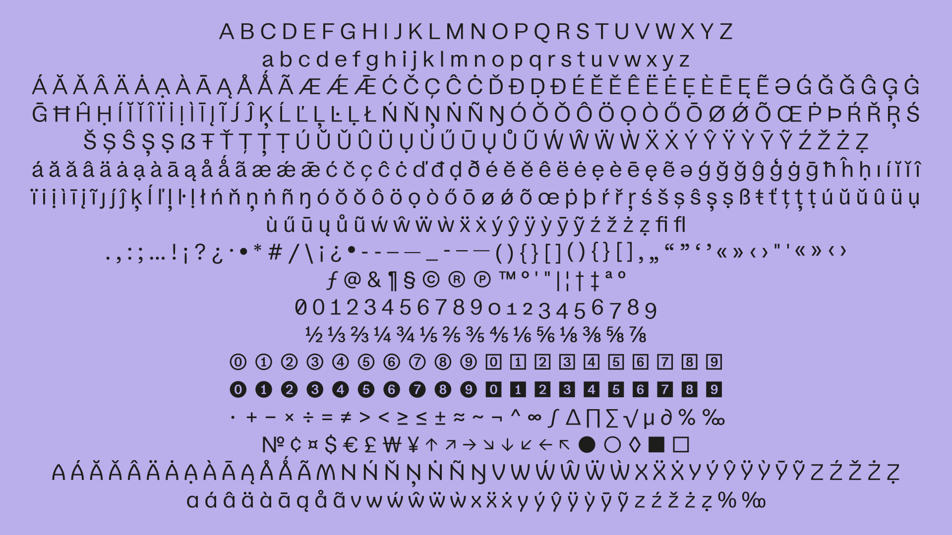
Viadukt is not a revival project and does not reference an existing typeface. It can instead be seen as an experiment exploring what happens when expressive flourishes and ornamental gestures—which we might typically associate with Art Nouveau—subtly find their way into the rational system of the classic Grotesk genre. Viadukt literally bridges the gap between expressive movements and modernist clarity. Hence its name. It can be Used for both body copy and display purposes, as its details blend well in text and, when used at larger sizes, create a unique typographic image. As stylistic alternates, it includes a stylistic set in which all diagonals of the letterforms can be converted into curved strokes.


Excerpt from Rudolf Larisch’s »Unterricht in Ornamentaler Schrift« (Zehnte Veränderte Auflage Öst. Staatsdruckerei, Wien 1929)
Lowercase a (Egyptienne) from Heinrich Hussmann’s »Über die Schrift« inspired the tension in Viadukt’s a-belly
Viadukt is not a revival project and does not reference an existing typeface. It can instead be seen as an experiment exploring what happens when expressive flourishes and ornamental gestures—which we might typically associate with Art Nouveau—subtly find their way into the rational system of the classic Grotesk genre. Viadukt literally bridges the gap between expressive movements and modernist clarity. Hence its name. It can be Used for both body copy and display purposes, as its details blend well in text and, when used at larger sizes, create a unique typographic image. As stylistic alternates, it includes a stylistic set in which all diagonals of the letterforms can be converted into curved strokes.
Sascha Bente-Loranzi is a type and graphic designer based in Berlin (D). Since completing MATD at ECAL Lausanne (CH), the practice has focused on typeface design, development and font production. With an emphasis on expressive forms, precise execution and lettershapes that combine strong character with functionality, the studio creates retail and bespoke typefaces, letterings and typographic identities for cultural, institutional and commercial clients. Alongside, Sascha works as a Type Designer at Dinamo.
☺ Contact:
+49 (0) 178 152 93 88
Speaking and Teaching:
Lecture »ECAL A Typographic Atlas«
at HGB Leipzig (2026)
Teaching Type Design
at Berlin International (SS 24, 25, 26)
Lecture at »Some Type of Picnic«
with HfG Offenbach (2024)
Teaching Type Design at
Universität der Künste Berlin (WS 22/23)
Workshop during Projektil Festival
at Bauhaus Universität Weimar (2022)
Lecture »Utopie im Design«
at HS Hannover (2018)
Press:
Journalist Magazin
Grafik Magazin
Shoplifters 10: New Type Design Vol. 2
New Aesthetic 1-3
Typodarium
Slanted
Der Tagesspiegel
Other Retail Typefaces:
Selected Clients:
ABC Dinamo
AllCaps Type
Dummy Verlag
Haus am Lützowplatz
Highsnobiety
KaDeWe Group
Lineto
Magis Design
Museum Selma
Sony Music
Studio Aurèle Sack
Vesper Milano
Awards:
European Design Award (Gold)
European Design Award (Jury Prize)
Unfortunately no capacity for interns
at the moment.
© 2026 Sascha Bente-Loranzi