


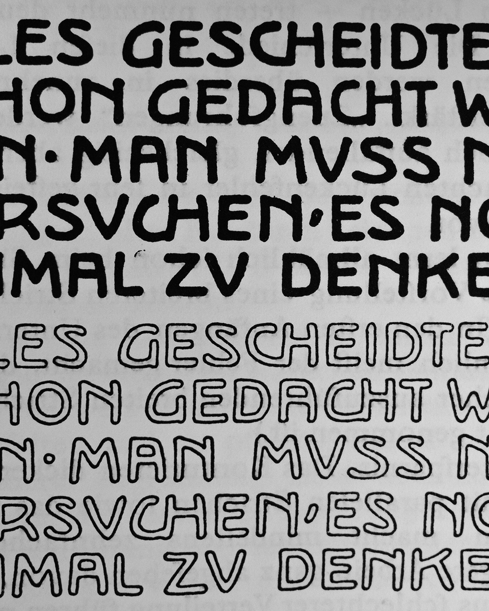
Excerpt from Rudolf Larisch’s »Unterricht in Ornamentaler Schrift« (Zehnte Veränderte Auflage Öst. Staatsdruckerei, Wien 1929)
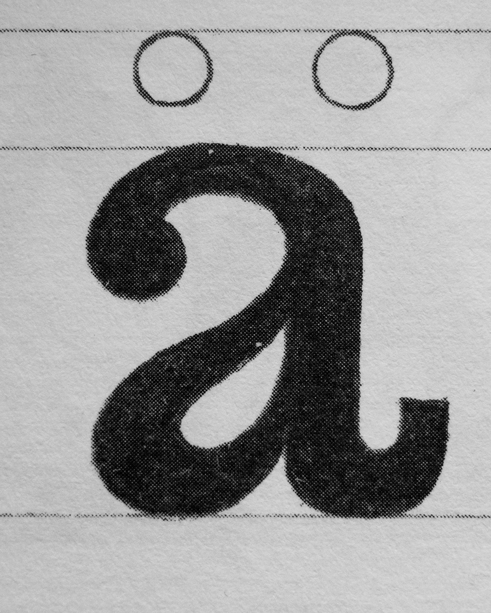
Lowercase a (Egyptienne) from Heinrich Hussmann’s »Über die Schrift« inspired the tension in Viadukt’s a-belly
Viadukt is not a revival project and does not reference an existing typeface. It can instead be seen as an experiment exploring what happens when expressive flourishes and ornamental gestures—which we might typically associate with Art Nouveau—subtly find their way into the rational system of the classic Grotesk genre. Viadukt literally bridges the gap between expressive movements and modernist clarity. Hence its name. It can be Used for both body copy and display purposes, as its details blend well in text and, when used at larger sizes, create a unique typographic image. As stylistic alternates, it includes a stylistic set in which all diagonals of the letterforms can be converted into curved strokes.

Index

EULA

Trials
Index
EULA
Trials