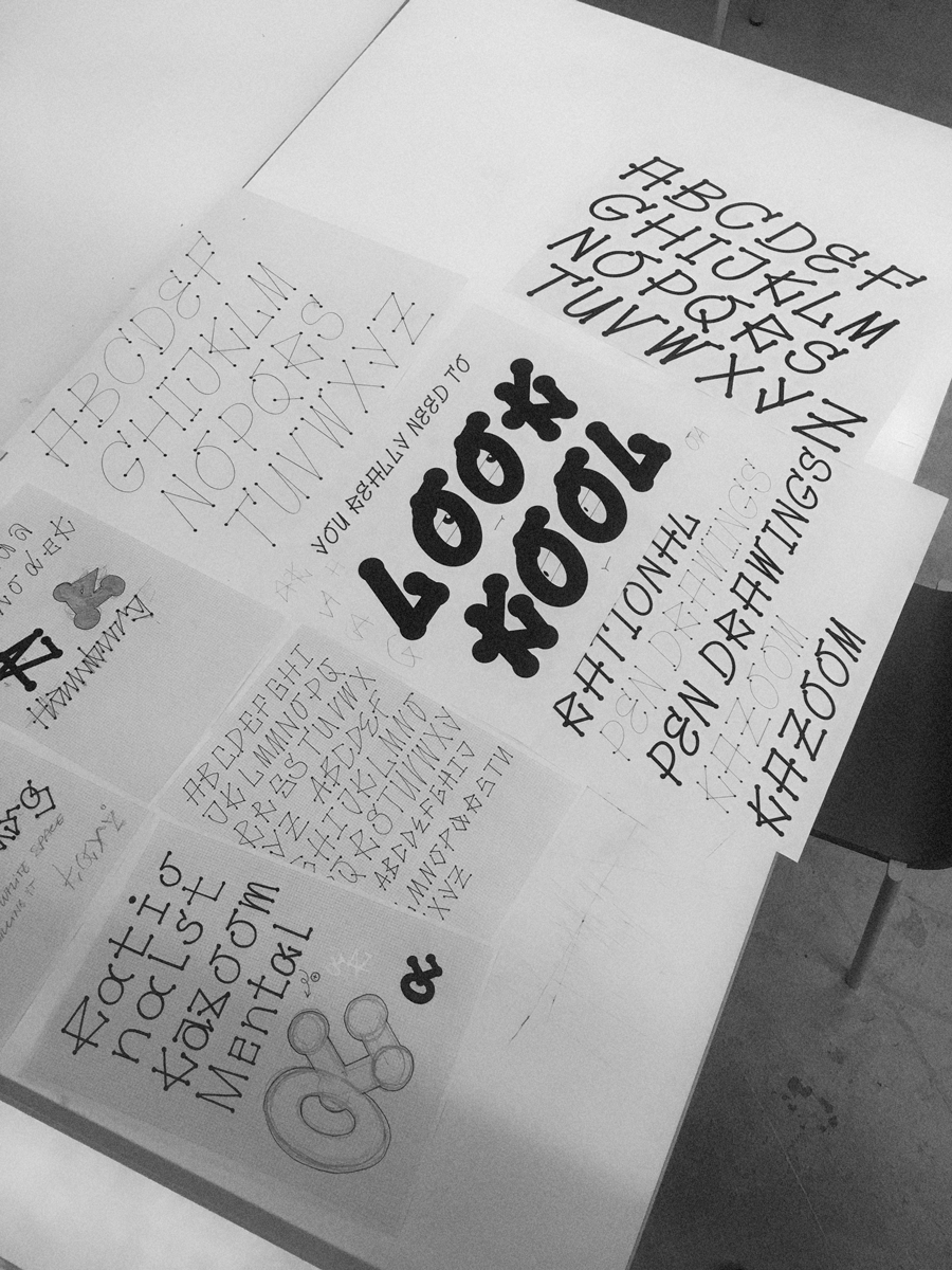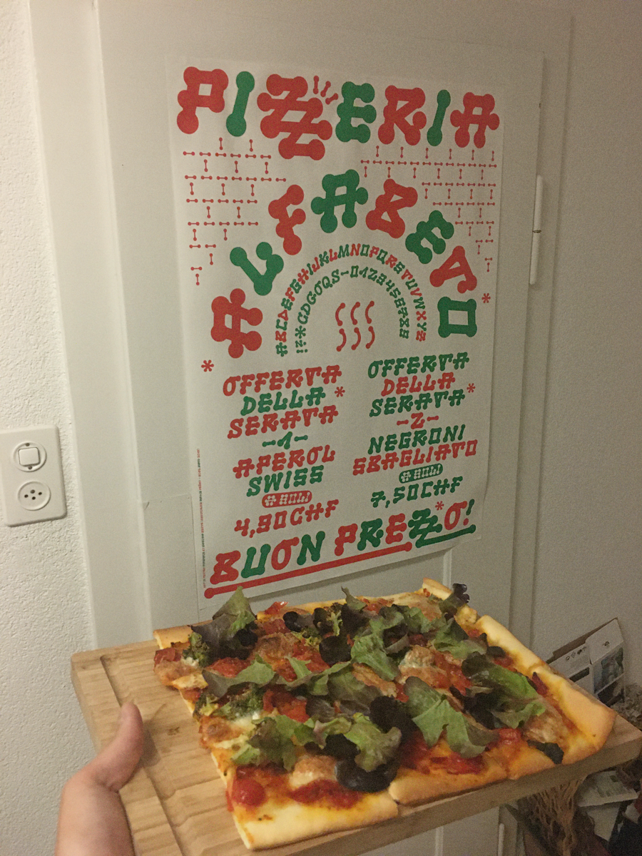

Penteks highlights the temporal moment when a pen rests on a spot longer than necessary (or too long?). The correction pen serves as a reference here, which creates bold dots where the correction fluid collects. This typeface is the result of a course led by Radim Peško at ECAL (2019).
Originally, the type was intended to work as a family. The different weights were determined by two factors: The thickness of the line and the size of the point. However, at a later stage, it has been found that the characteristics of the letters are displayed best in the medium to heavy weights. Therefore, Penteks has evolved into a pure display typeface.